
Today, a brief but we hope all the more valuable contribution for all cellists. You may also consider it a bow to the great composer Max Reger who died almost exactly 100 years ago (on 11 May 1916).
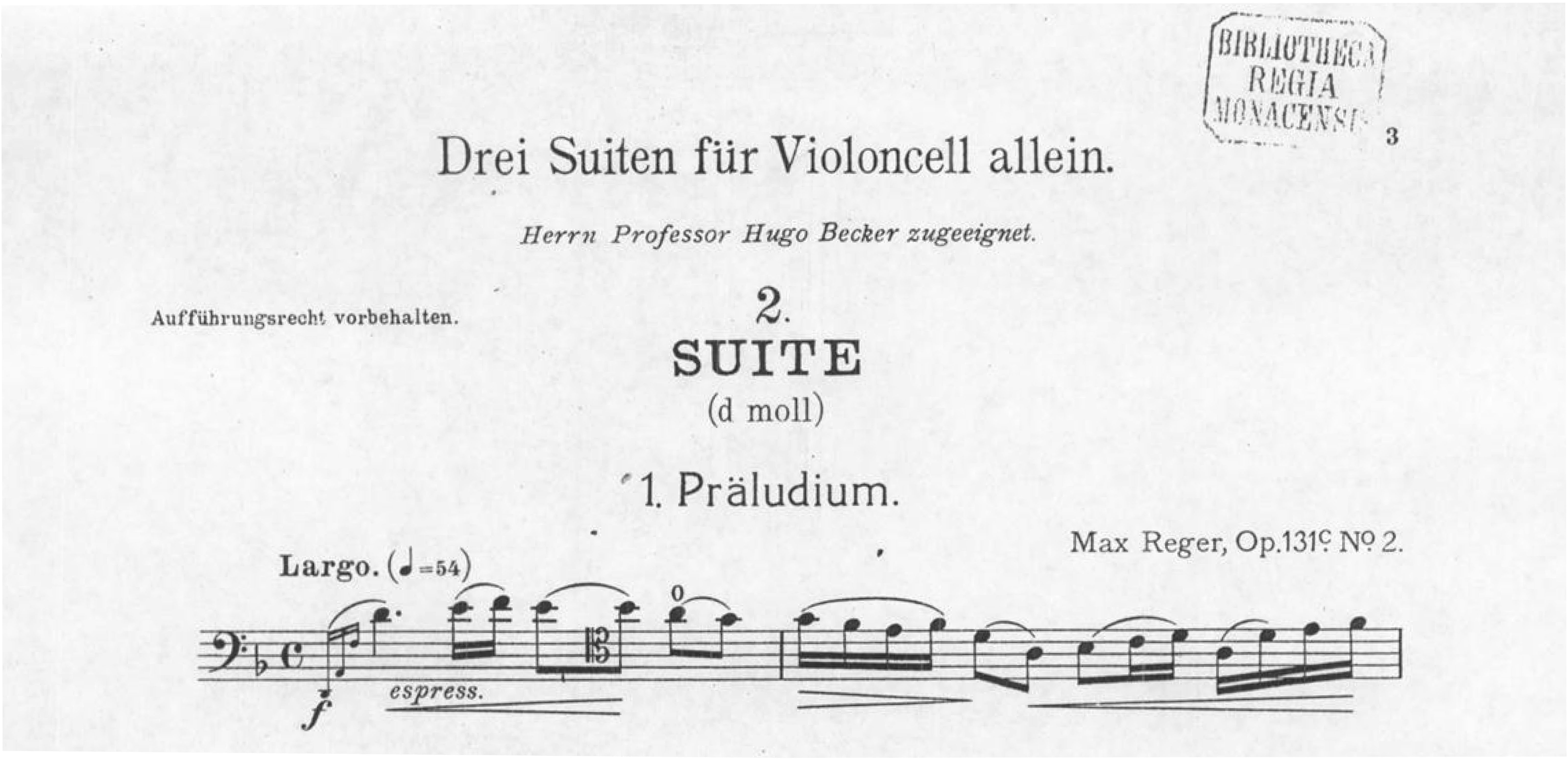
At the start of the 1990s, my Urtext edition of the “Three Suites for Cello Solo,” Opus 131c, together with the edition of the three violin suites HN 468, opened the series of our Reger works in Henle Urtext editions that have meanwhile grown very numerous. Reger’s manuscript of these three magnificent works has remained lost. The works were first published by the N. Simrock publishing house in July 1915, thus less than a year before Reger’s death. From our Reger thematic catalogue published a few years ago you can learn all the important information about the genesis and sources of Opus 131c. Here, exclusively for our blog readers, is the scan of the respective pages.
Reger obviously proofread the text meticulously, for there are only a few problems in the first edition. Then, the C. F. Peters publishing house took over the engraving plates unchanged, incidentally, for its reprint (only fingerings were added later – but by whom?). A few fine corrections were still clearly necessary. I had to adjust many slurs or dynamics placed differently at parallel spots (always, of course, with footnoted reference); I left unchanged differing notes at unambiguous parallel spots (for instance, recapitulations), but referred to these in my edition.
Well, a few weeks ago we received an email from the cellist and music pedagogue Christoph Otto Beyer in Aurich containing excellent suggestions for improving the second suite. I am taking Mr Beyer’s letter as the occasion for appropriately improving my edition and for disclosing these revisions in the following (since it will be another 2 years at the earliest before the revised printed edition will appear as a reprint).
So, listed here are the detail corrections to the Henle edition of Reger’s Cello Suite, Op. 131c, presently on the market:
1. In the Gavotte, measure 48 (p. 11), the p probably should better be shifted a quarter note to the right (thus at the 4th quarter note), as can be gathered from all parallel spots, rather than at the 3rd quarter note as in the first edition.
2. In the Gavotte, measure 50 (p. 11), there is no wavy arpeggio line for the chord printed in the first edition, unlike all (!) other spots. I think that this chord should also be arpeggiated, although a “simultaneous pizzicato” (Beyer) would, of course, also definitely be possible. So, I put the wavy line in parentheses in order to identify it as my editorial addition.
3. In the Gavotte, measure 68 (p. 11), there is no staccato dot on the final quarter in the first edition. Perhaps, it is intentionally lacking? I think that it is an engraving error, which is why the dot is in parentheses.
4. In the Largo, measures 28–29 (p. 12), the dashed ritardando extends a half measure too far (it must end already with d1, the 2nd quarter note of m. 29).
And now for two interesting, more general aspects addressed by Mr Beyer:
5. Reger’s “almost obsessively used indications for harmonics,” as Mr Beyer rightly observes, are, properly understood, not fingerings, but an “aesthetic and timbre dictum” of Reger’s (Beyer). But we reproduce these Reger “0” designations in italics (= slanted), just as we customarily do with original fingerings (i.e., those by the composer); see also the footnote commentary on p. 1 of my Reger edition. What do you readers think? As of the next issue, should we reproduce this sign in normal (non-italic) type instead of italics, because it deals with the “0” harmonics rather than with the fingering?
6. Reger’s metronome markings are in parentheses in the first edition:
Such use of parentheses is, incidentally, encountered in very many early printed editions by publishers of various composers’ works. We reproduce metronome markings on principle without these ( ), for, first of all, with us marking in “( )” always means editorial additions over and above the sources; and second, we don’t attach any deeper significance to the use of parentheses.
Now, cellist Beyer writes that he misses these parentheses. He interprets them – if I rightly understand him – as indicating an intended easy retraction of mandatory significance. What are our readers likely to think? Is adding parentheses significant, and if so, of what? Then, we must adopt them in the Urtext.
Again, I warmly thank our sharp-sighted customers who, we hope, will still not discover very many more such little errors ☺. And when they do: Never hesitate to let us know – we can only do better with the help of “our” musicians who use our editions and pose questions in return. I am standing by my promise: Any perceived error that you bring to our attention shall be very conscientiously checked out in the sources and according to musical criteria by our scholarly editors, personally responded to, and the correction made where applicable in the next issue. The Reger cello suites demonstrate this once again.
Reform para 5
I would not like to see harmonic (or open string) o in italics.
Why do you want to show composer’s original fingerlings in italics?
Best wishes, John
Dear John,
it is one of our basic publishing principles to distinguish visually between the original musical text and our own additions. If we add an articulation sign, for example, it is put in parentheses (see above example 3).
With fingerings, parentheses aren’t viable, so we use roman and italic type as a way of differentiation: roman for our added fingerings, italic for the original ones stemming from the composer. (Since the latter are usually much rarer in a score, we chose the more uncommon italic type for them.)