
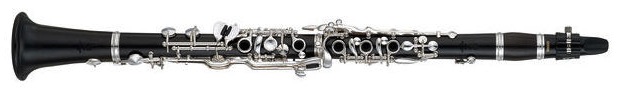
The clarinet was again featured in our recent editions of two important works to steadily expand its repertoire in our woodwinds’ catalogue.
First mention goes to the splendid Clarinet Trio op. 114 by Johannes Brahms, appearing meantime in volume II/7 of the Johannes Brahms Gesamtausgabe (HN 6026, edited by Katharina Loose-Einfalt). To go along with this reference music text we’ve also newly published the Trio in a practical separate edition (HN 1125) to replace our earlier edition HN 322, now already 40 years old. It goes without saying that the new edition of the music text was completely re-engraved, presenting the Trio in a fresher, optimal quality.
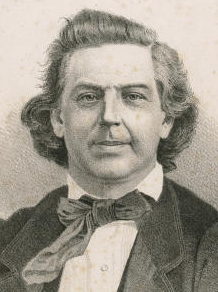
Niels Wilhelm Gade (1817–1890)
Furthermore, we also welcome a new entry, long desired in our catalogue: the four Fantasiestücke op. 43 for clarinet and piano by Wilhelm Gade (HN 1353).
The Danish composer, celebrating his 200th birthday this year, wrote the four pieces in the spring of 1864 for his Danish friend Mozart Petersen, solo clarinettist in the Royal orchestra in Copenhagen. (He owed his unusual given name to his father, likewise a clarinettist, who especially loved Mozart’s music. He christened his second son, incidentally, “Crusell” – no joke – after the Swedish-Finnish clarinettist-composer…)
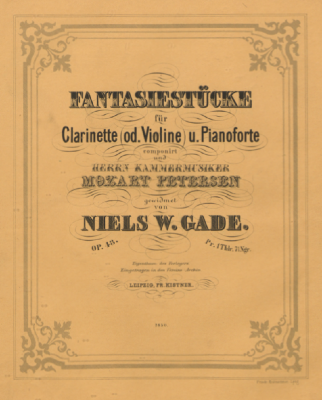
First edition, Leipzig, 1864
The source situation for the Fantasiestücke op. 43 is basically uncomplicated: serving our edition as main source is the first edition authorised and supervised by Gade that appeared in August 1864 in the Leipzig publishing house Fr. Kistner. (Incidentally, the 1865 publication date of this first edition in the Gade works’ catalogue and in many dictionaries and modern editions turned out to be erroneous, probably based on inaccurately dating the plate number.)
Consulted as an important secondary source was the autograph, preserved in the Royal Library in Copenhagen. Since the autograph did not serve as the engraver’s model, there must also have been a (presently-lost) copy that Gade presumably once again rechecked and altered slightly: the tempo marking of the first piece in the autograph still reads Larghetto con moto instead of Andantino con moto.
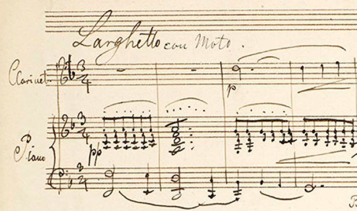
Autograph, Beginning of the first piece
But as so often in the case of works for a solo instrument with piano accompaniment, the devil is in the details, for the clarinet music text is in fact given in duplicate: in the clarinet stave of the score as well as in the separate part. Although the notes are the same, there are innumerable minor differences in articulation, phrasing and dynamics (see the music example).
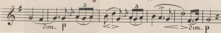
Solo part (written in B flat)
Piano score (written in C)
What’s more, there is even in the autograph already a separately written out solo part – Gade presumably once rehearsed the work with Petersen. So, 4 sources for the clarinet’s music text had to be compared and critically evaluated. This clearly showed that the separate part was in general more accurate, complete and coherent in articulation and dynamics in the autograph and first edition than in the piano score (probably due to the “practical try-out” with Petersen). In our edition, therefore, the separate part of the first edition is the main source for the clarinet part.
In light of this issue, it was ideal that the Fantasiestücke edition was in the hands of our experienced editor Nicolai Pfeffer, who as clarinettist was able to evaluate these detailed questions from a philological as well as a performance and technical perspective. With our edition, clarinettists need not discuss contradictory information with their piano accompanists, but can concentrate on the music – and maybe eventually sound as good as in this recording:
“…the new edition of the music text was completely re-engraved, presenting the Trio in a fresher, optimal quality.”
I think that the writer is mistaken in thinking that the re-engraving is of optimal quality. In general it has the anemic, uninviting appearance typical of so much computer engraving. The most noticeable specific problem is the exaggerated arch to the medium to long slurs. When one compares it to the old Breitkopf and Härtel Complete Works, one sees the difference.
http://ks.imslp.info/files/imglnks/usimg/d/d4/IMSLP114012-PMLP41026-Brahms_Werke_Band_9_Breitkopf_JB_34_Op_114_filter.pdf
Along with correctly shaped slurs, the Breitkopf exudes the warmth and humanity missing in the new Henle edition. It is a real tragedy that the major publishing houses do not care to maintain the high engraving standards of editions of the past. It is possible on a computer, but only with the appropriate settings and human intervention.
Best regards,
John
I am sorry to hear that you are dissatisfied with the appearance of our engraving. We attach the greatest importance to this aspect and usually receive very positive feedback from performers and musicians for the looks of our scores. Even if we use computers nowadays, our three engravers are highly skilled experts, and you can believe me that there is a tremendous amount of “human intervention”, as you called it, involved in the layout and the fine-tuning of our scores. Of course, tastes differ, and what may look “crisp” to one person may seem “anemic” to another.
And one more thing that I’d like to point out: when we switched over to computer-assisted engraving, we took the trouble to digitize all musical signs from our hand-engraved scores, in order to create our own distinctive music font. So unlike with many other publishers who use run-of-the-mill fonts shipped with Sibelius, Finale or Score, our editions feature a unique typeface preserving the hand-engraved look of the “good old times”…
Best regards,
Dominik
I totally disagree with John. Current digitized editions, in almost all cases, are much better than the hand engraved ones, even the ones engraved by the most professional engravers. A major reason is the resolution of hand engraved edition is not comparable and this is why now you see 2K, 4K or HD everywhere. It is understandable that some people still cannot forget the old time but it is due to emotional reasons only. Your comment is reminiscent of similar stories in the field of photography and audio equipment. No matter how popular the digital camera is, some people still prefer film camera as they also claim the photos “exude the warmth and humanity”, which is mainly because they spend more time in the process of printing. A more extreme case is perfectly demonstrated by one conversation with an LP lover friend. When more and more people switched to CD or other digital forms, I asked him why you still like LP except for some emotional reasons. His answer is that he cannot live without the slight noise made by the vinyl record player. We certainly should not criticize some people, e.g., John here, to like the old editions. However, blaming new editions by saying it is lack of human intervention, in my opinion, is unacceptable.
I am sorry, Zheng Li, but I think you misunderstood my post. As I said, it is possible for computer engraving to equal the best engraving of the past. In fact, I think that it can surpass it. I spend many hours a day engraving music at a computer and certainly understand its capabilities. As you point out, computer images are by their nature much clearer than hand engraving. They can also be manipulated more flexibly. For example, the slurs produced by Finale are probably the most beautiful ever seen in music engraving. And there are many current engravers who produce superb work with a computer.
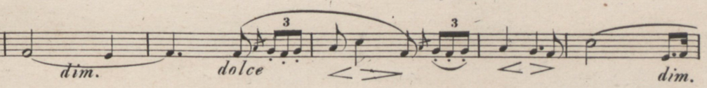
Dear Dominik Rahmer, thank you for your response. An example: Brahms Clarinet Trio, first movement, measure 196, left hand of the piano. Why does the slur arch so high and occupy so much space between the staves that it crowds the right hand? It is not avoiding accidentals or fingering. And I see the same in m. 195 and throughout the piece.
In the example from the Brahms Complete Works, longer slurs are flattened to stay out of the way of the other elements and preserve as much white space on the page as possible. As a result, the slurs recede to allow the notes to stand out. This gives greater clarity as well as beauty and aids the player in reading the music. To me, the Complete Works looks vibrant and three dimensional because the various elements are presented appropriately.
I completely agree with John. Claiming that the only aspect of music notation that matters is the resolution of the printed notes is like claiming that a lifeless computer playback of a symphony, with all the notes and rhythms perfectly correct, is better than a human performance and that we should just move forward. That’s not even excepting the cases where a computer will make things less clear or readable, still persisting in a lot of professionally-published music today. The computer’s “judgement” on its own is inadequate.
For what it’s worth, although I share many of John’s misgivings about current Henle output, I also appreciate that they’re one of the few publishers that at least tries to put effort into their publications, even if they don’t always succeed. We need more of that in this field if we’re to rescue the profession from its current state of mediocrity.
I have to say that I totally agree with John and Jeremy about the inferior quality level of computer-based engraving to the manually engraved scores of the past, Henle’s output included. Of course it’s true that Henle, as one of a few publishers in the very high end of the music publishing industry, still releases scores that are well above average in quality. Then again it’s sad that the the advent of computers seems to have had a negative effect on the quality level over all, rather than a positive one. As John points out, there seems to be no good reason for this development, given the precision, flexibility and efficiency afforded by today’s notation software.
Speaking of resolution with regard to the plate engraved, offset printed scores of the past doesn’t make much sense, There are no pixels involved in this technology, and so the concept of resolution doesn’t apply. It’s totally legitimate to prefer digital over analogue with regard to photography or audio, but it’s very difficult to argue that one is objectively better than the other. It depends on what you emphasise – what you deem important.
In any case this debate over manually engraved vs. computer-engraved scores are much more analogues to mass-production vs. hand crafted products. After all, the old techniques of manual engraving required well-educated craftsmen, while nowadays, anyone can reach a reasonable level of quality using software and their home computer. You may of course prefer IKEA over your local cabinet maker, your average clothing store over your average taylor or the super market over the farmers market, but chances are, you’d have a difficult time defending your choice purely on the basis of quality.
On the other hand, the superior quality level that Henle is associated with is very difficult to achieve, even with the help of modern technology. It requires a vast knowledge of craft comparable to that of the old plate engravers. And since most developers of notation software are not professional engravers, it requires engravers that are secure enough in their abilities to not rely on the default settings and suggestions presented by the software. It is pretty clear that Henle, like most other publishers, have fallen into the trap of relying too heavily on software defaults and automatic behaviour. Perhaps this is due to lack of knowledge on the part of the engravers or perhaps it’s a matter of efficiency. In any case, it’s very unfortunate.