
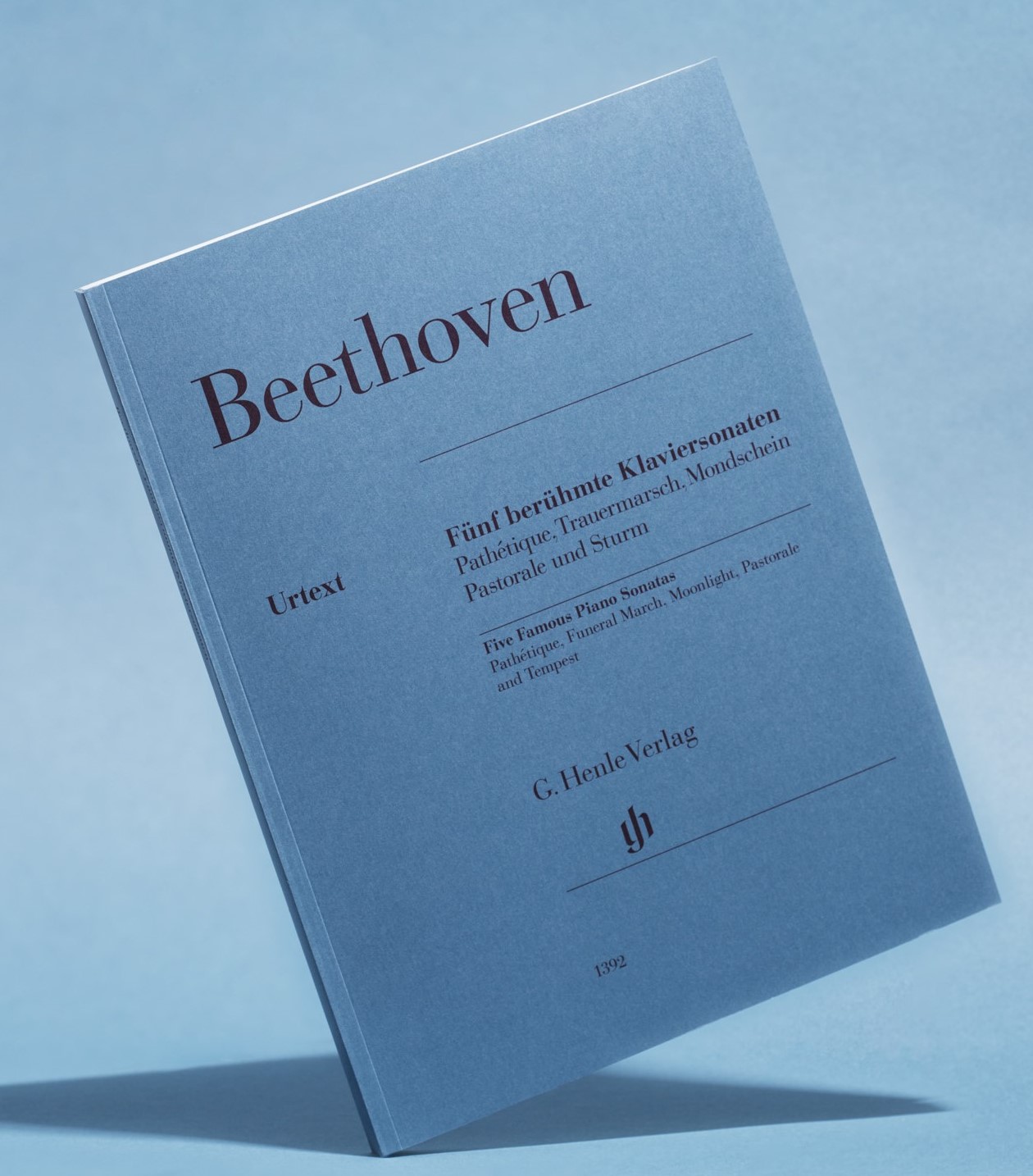
 If you quickly want to describe a Henle edition, one sentence is enough: it is the pigeon-blue music score, showing on the cover merely composer and title without any ornamentation. For where other publishing houses employ a large graphics department and select the most diverse fonts, designs and illustrations for different composers, eras or scorings, or at least vary the colour of the card stock cover, holding sway at Henle are the strict rules of B&B: blue cover stock and Bodoni font. Can a blog post be written about something like that? Of course! For first of all, knowing where this minimalist design originated is of interest, and then we editors can tell you a thing or two about how difficult it sometimes really is, to say everything in the few lines stipulated by our strict layout – or at least enough to make the content instantly recognisable. Continue reading



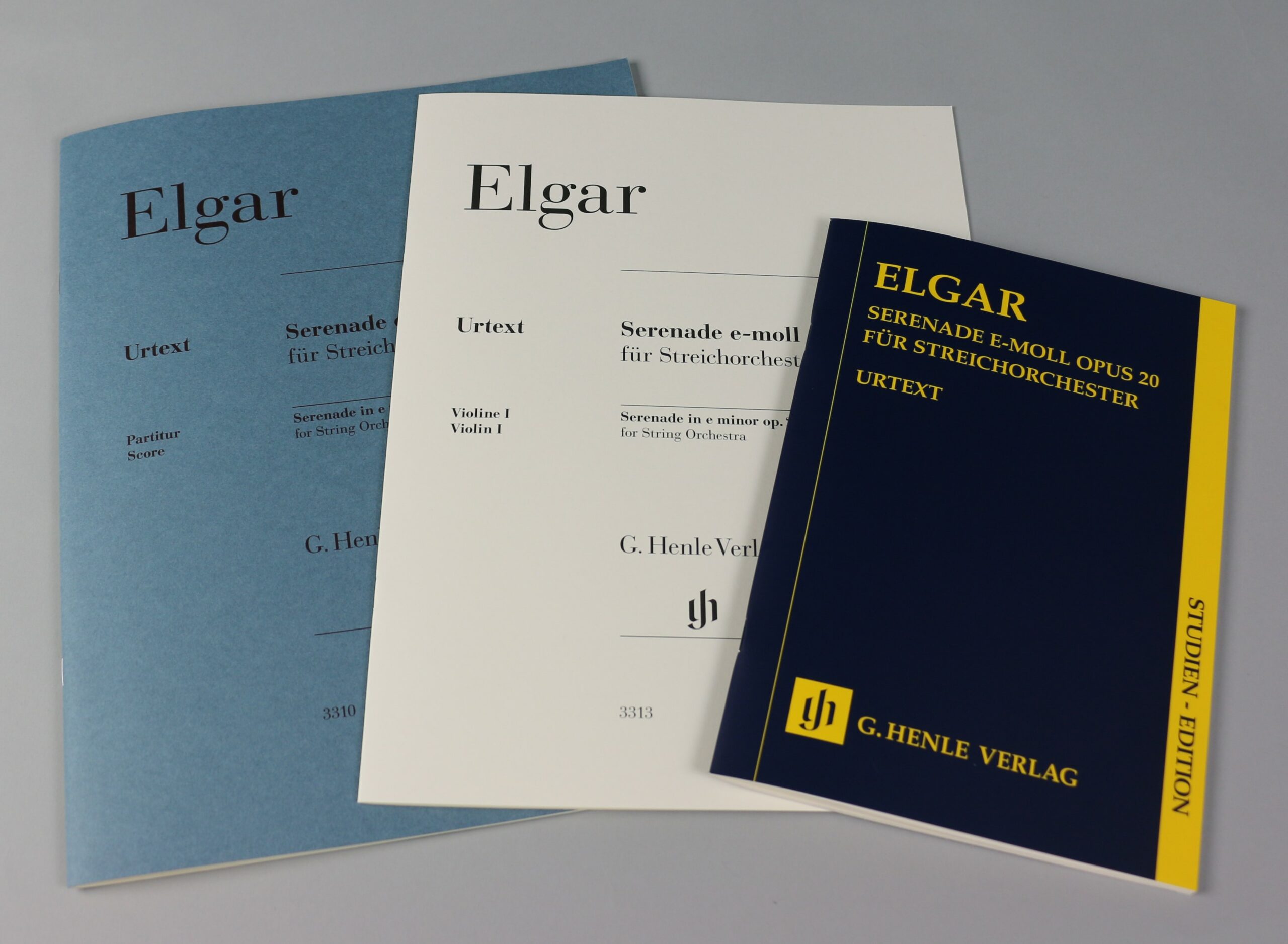


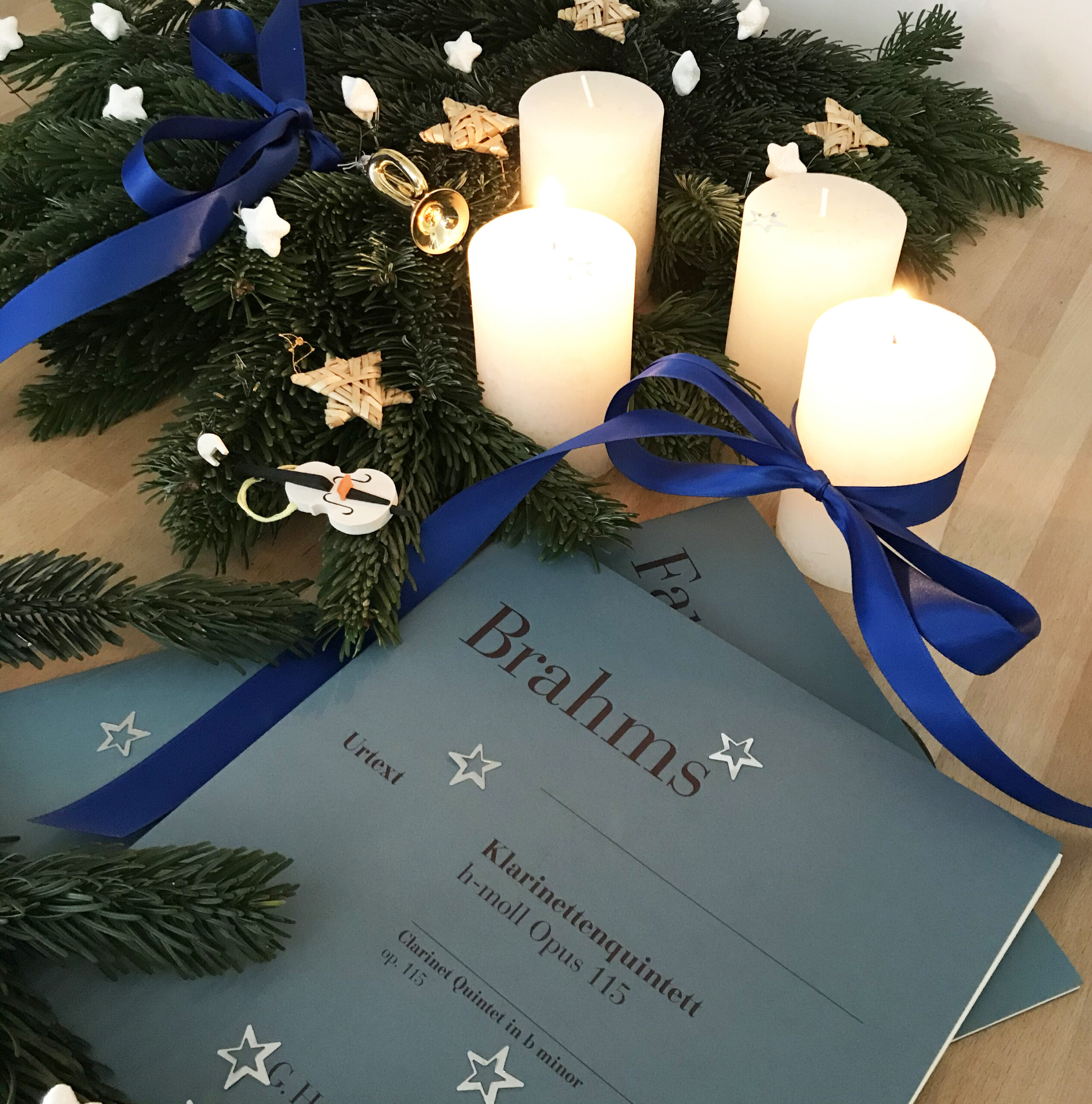
 Our new Urtext edition
Search
Subscribe2
-
Recent Posts
- Scott Joplin, the “King of Ragtime Writers,” now in Henle Urtext. Interview with Joshua Rifkin
- 25 Etudes, but not just finger exercises – Friedrich Burgmüller’s famous opus 100
- Summer Break
- Culminating a great female composer’s career: Emilie Mayer’s Cello Sonata in D major, op. 47 – new in the Henle Urtext
- An anniversary tribute 200 years after his death: Carl Maria von Weber’s Bassoon Concerto, op. 75, now available in Henle Urtext
Tags
accidentals arrangements autograph Bach Bartók Beethoven Brahms Carnival Chopin Christmas clarinet Debussy Double bass Dvorak dynamics Fauré fingering first edition genesis Haydn horn instrumentation Liszt Mendelssohn Mozart notation piano piano concerto piano sonata Rachmaninoff Ravel revision Saint-Saëns Schubert Schumann string quartet urtext variant reading variants variations versions viola violin Violin Concerto Violin Sonata